We share some of the best practices and recommendations when creating your art for your DTG apparel products!
Find the printing specifications
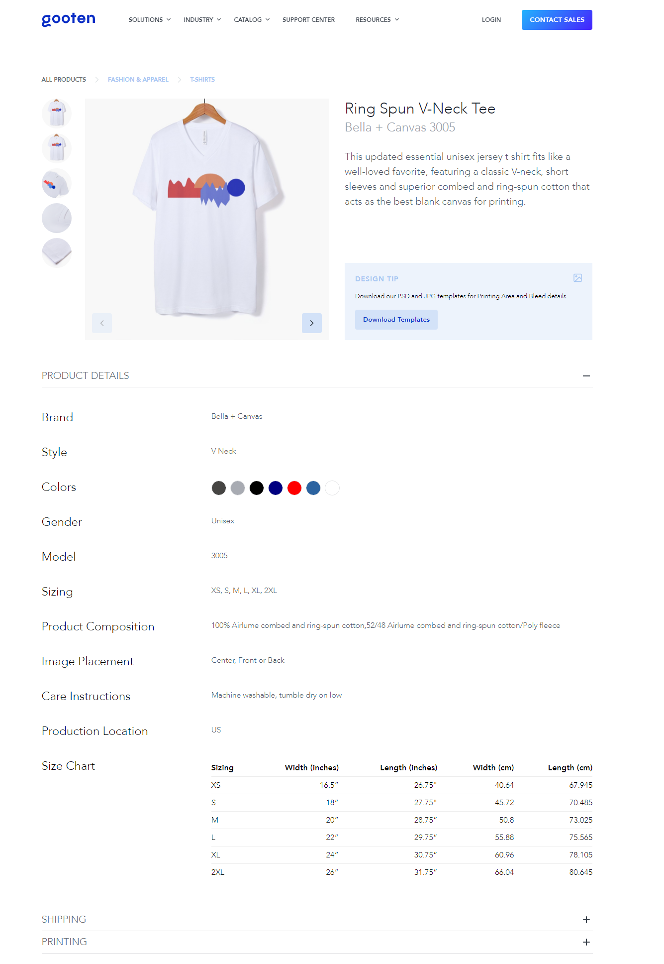
Each product in our product catalog has pixel dimensions that can be used to create artwork in Photoshop or your favorite image editing software. Some products also include templates you can download to help you get started.
Let's check out where you can find the print specifications for products in the Product Catalog.
1. Go to the Product Hub and select a product.
2. Click on the Product Details section.
Creating Design Files
We recommend that you create your design files in CMYK, convert them to RBG, and then save the file in a PNG format with 300 DPI.
The standard print area for most t-shirts and apparel garments is 15" x 19" or 4500px x 5700 px. We recommend positioning your art in Photoshop prior to uploading it to Sensaria. You can find downloadable templates to help with this using the section above.
We also recommend that you consider boosting the saturation of your images.
- In Photoshop, you can go to the Image tab, click Adjustments, select Hue Saturation in the settings and move the saturation slider up about 10 to 20 points.
- Don’t overdo the saturation. You just need to get the colors to pop a little.
You can also help an image by using the Tone Curve option to improve the contrast of the image. Some people use what’s called an S Curve. This darkens the shadows and lightens the highlights which makes a huge difference with a flat image.
- In Photoshop, go to the Image tab, click Adjustments, and select Curves in the settings to find this option.
If your design contains black or white components, make sure they are true black or true white. A solid black or solid white color on the monitor is sometimes not true black or white. True black is 0 levels of RGB. True white is 255 levels of RGB. Any other reading means the apparel printer will try to put a small amount of color where there should be total black or white ink.
Color Matching
The color of the shirt you're printing on plays a part in how design files will look printed. If you order a white t-shirt and a light grey t-shirt, the colors will likely look a bit brighter on the white garment. Darker-colored garments will be printed with a white under the base under the artwork which causes the colors in your design to "pop" as much as possible. It's normal for the print results to vary slightly between white, black, and blue shirts due to these variances.
Your design should include solid colors, as designs with lower opacity or partially transparent areas don’t tend to turn out well with DTG printing methods.
Keep in mind that any transparent areas in your design will end up showing the base color of the shirt. So on a red shirt, transparent areas in the image will end up red and the same design on a black shirt would show black.
DTG printing is meant for complicated multi-color images, images with gradients, and details. It’s not the best option for large solid blocks of one color. For the latter, you will achieve better results with screen printing rather than DTG printing.